The NASA-SpaceX Dragon crew launch on 30th May kept the space enthusiast and others excited across the US and a large part of the world. One image that captured my attention was the SpaceX vs. Space Shuttle image in a tweet. The difference is staggering & phenomenal. If we assume for a moment that the problem solved by both spacecraft designs are the same, the outcome couldn’t have been much different. The problem statement was the same. The physics and the parameters like orbital velocity, altitude, etc., should have been the same. The mission objective is more or less the same. From Earth fire a rocket with humans and reach the International Space Station. There are a few key differences in the mission objectives. The space shuttle was designed to carry out experiments in space. It was not just a vehicle to transfer astronauts to and from a space station. In this way, it is a mini-space station by itself. If you keep aside such differences, what are the factors that could have influenced this difference in the user interface?
1) Technology Evolution:
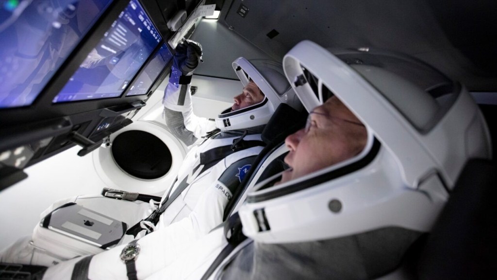
This is the first item that comes to my mind. The displays, the electronics, that were available in the late 1970s and early ’80s when Space Shuttle was designed were very different from what we have today. For example, the aircraft control panels have evolved from minimal usage of electronics and screens to Multi-Function Displays (MFDs) to a Chromium-based touch-screen user interface in SpaceX dragon. If you take the evolution of airplane cockpit design, it has moved from round electro-mechanical instruments to Multi-Function Displays, i.e. LCD displays which can be configured to display different measurements. In the aerospace industry, the aerodynamic design and the physical airframes last for a very long time. During this period the electronics & computational part of it becomes obsolete due to its fast-evolving nature as per Moore’s Law. The designers try to manage this velocity differential across the electronics and mechanical domains when coming up with a product.

2) Priority and focus of the organization:
NASA and Russian space agencies have a heavy focus on the safety, reliability, and functionality of the cockpit & instrumental panel. The usability and elegancy wouldn’t have been a major driving factor in their designs. Whereas Elon Musk places emphasis on the elegance & user experience in addition to other factors. You might have observed the consistent usage of white and black pallet used across the SpaceX commentators’ jackets, the rocket launch pad and in the astronaut’s spacesuits. Similarly, Elon’s other venture Tesla has also prioritized simple and elegant design. The radical shape of the air-conditioning vent, the large LCD display have drawn attention to their design. All of these point to an organization which doesn’t want to compromise on user experience is willing to take risks and trying out new ideas.

3) Structure of the organization:
What role could the organization structure and its objectives play a role in this? We can only answer this question based on the knowledge available within the public domain about NASA and SpaceX. They couldn’t be much different. One is a public organization with an enviable history and achievements. The other is an infant growing super-fast with a very ambitious vision. The sourcing philosophy of SpaceX and NASA are also very different. NASA is known for contracting out sub-components and focusing on R&D, assembling the vehicle, verifying supplier quality, etc., whereas SpaceX builds a lot of its components in-house.
There was an AMA session on Reddit by the SpaceX team. It provides some insights into the software arm which built the cockpit interface and other software used in this launch. By going through it you can see that the team brings an outside-in view. Some of the engineers who are part of SpaceX have worked earlier in Tesla. Within SpaceX, they are working across Starlink, Starship, and other projects. One of the engineers in his comments has compared the software running in Starlink satellite cluster to servers running in a data center.
These organizations are different in their purpose, principles and the way teams are brought together. These factors could have played a key role in challenging the traditional notions and coming up with a fresh paintbrush to design this interface.

4) Simplification
Space shuttle tried to be a launcher as well as a space station built into one. It can not only reach the orbit but also carry out experiments when it is there. Whereas the Crew Dragon is an example of a “Single Purpose” design. Its job is to take the astronauts to orbit safely, reliably, and in a cost-effective manner. The decoupling of the two purposes would have definitely simplified the design. This might have given the designers more leeway to simplify the user interface.
SpaceX and Apple have delivered a delightful, simple, beautiful interfaces across consumer goods, automobiles, and aerospace. Even though in both cases the customers were not demanding it. These two organizations are heavily focused on their purpose. Apple’s purpose is to bring the best user experience to its customers through its innovative hardware, software, and services. Similarly, Elon’s passion to establish a human settlement on Mars is well-known. What I find interesting is that SpaceX has emphasized on user experience, even though its customer NASA or the astronauts as users may not have explicitly demanded it. This is where I see SpaceX living up to Steve Job’s famous quote,
“Some people say, “Give the customers what they want.” But that’s not my approach. Our job is to figure out what they’re going to want before they do. I think Henry Ford once said, “If I’d asked customers what they wanted, they would have told me, ‘A faster horse!'” People don’t know what they want until you show it to them. That’s why I never rely on market research. Our task is to read things that are not yet on the page.”
The interesting aspect of the SpaceX and Apple iPhone is that the availability of technology is not the main constraint. Multi-touch capacitive touchscreen alone won’t have helped Nokia win the smartphone battle with Apple. What we may increasingly see is that simple and elegant interfaces will play a big role in defining your product across the industry. Michal Malewica’s wonderful article shares the same vision. To achieve this, it is important to get clarity on the vision for a product & its features, ensure focus on user experience, and align the organization to support it.
References and Image Credits:
Tejas Light Combat Aircraft – Glass Cockpit
Indian Defence News – First Look of the Advanced Cockpit of Medium Weight Fighter (MWF)
Behold! SpaceX’s 1st Crew Dragon Spaceship Is On the Launchpad
